Color is one of the most powerful and underestimated tools in restaurant design. Before a guest even reads a menu or tastes a dish, their brain is already reacting to the environment—and color is often the first signal it processes. From fast-food chains engineered for quick turnover to fine dining establishments designed to slow time and elevate experience, color plays a central role in shaping appetite, mood, and ultimately how much customers spend. Understanding how restaurant colors influence behavior isn’t just an artistic decision; it’s a strategic one. When used intentionally, color can increase table turnover, boost perceived flavor, enhance comfort, and subtly encourage higher spending. In a competitive dining landscape, mastering this visual language can transform a space from forgettable to irresistible.
A: Warm tones like red, orange, and certain yellows are commonly associated with energy, stimulation, and appetite appeal.
A: Blue can feel cooler and more restrained, and it is generally considered less appetite-activating than warm hues.
A: Yes, indirectly. Color helps shape mood, comfort, pace, and perceived quality, all of which can influence spending.
A: Deep neutrals, charcoal, olive, burgundy, black, and warm metallic accents often create a more refined atmosphere.
A: Not always. Bright colors can energize a space, but balance is important so the room still feels comfortable and intentional.
A: Green is the strongest cue for freshness, produce, wellness, and natural ingredients.
A: Absolutely. Lighting can warm up, cool down, soften, or intensify a palette and change how food looks on the table.
A: Yes. Accent colors can guide attention toward specials, profitable items, or signature dishes.
A: They can, especially when paired with strategic lighting and contrast, but too much darkness may make tight spaces feel smaller.
A: Warm neutrals with natural wood and selective accent colors usually offer flexibility, comfort, and broad customer appeal.
The Psychology Behind Color and Human Behavior
Color psychology explores how hues influence perception and emotional response. While individual preferences vary, research consistently shows that certain colors trigger predictable reactions. Warm tones like red, orange, and yellow tend to energize and stimulate, while cool tones like blue and green evoke calmness and relaxation.
In a restaurant setting, these psychological responses become particularly important because dining is a multisensory experience. Color affects not only how people feel but also how they perceive taste, freshness, and even portion size. A well-chosen palette can make food appear more appetizing, enhance the dining atmosphere, and subtly guide customer behavior without a single word being spoken.
The key is alignment. A restaurant’s color scheme must match its concept, target audience, and desired pace. A bustling burger joint thrives on different visual cues than a candlelit bistro. When color aligns with purpose, the result is a seamless and immersive experience.
Red: The Appetite Accelerator
Red is one of the most widely used colors in the food industry—and for good reason. It is known to increase heart rate, stimulate appetite, and create a sense of urgency. This makes it especially effective in fast-paced environments where quick decisions and rapid turnover are essential. In restaurants, red can make food appear richer and more flavorful. It draws attention and encourages action, which is why it is often used in logos, signage, and accent walls. However, its intensity can also be overwhelming if overused. Too much red may create stress or shorten the dining experience more than intended. Strategically applied, red works best as a highlight rather than a dominant color. It can guide the eye to key areas such as ordering counters or featured menu items while still maintaining balance within the space.
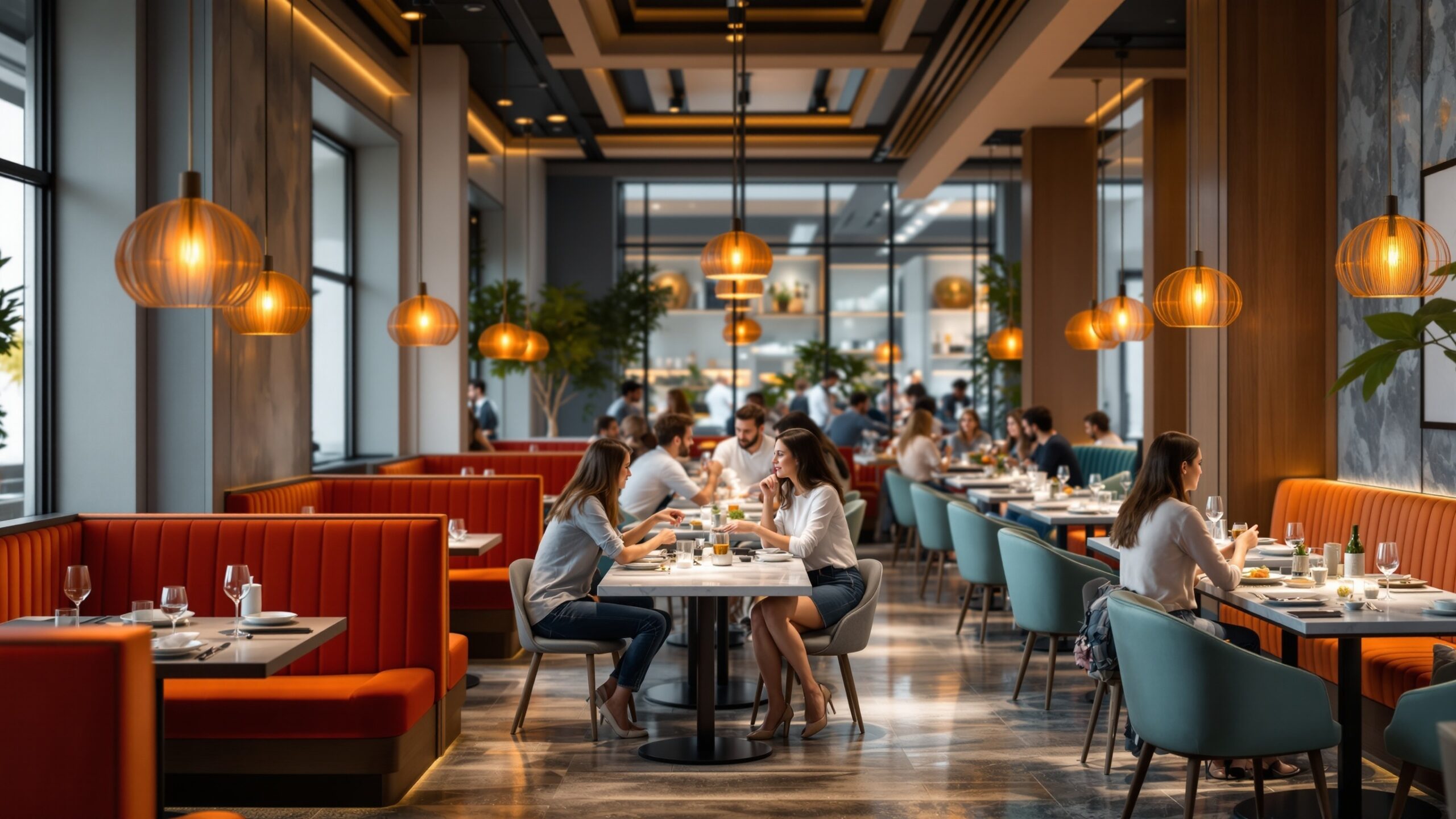
Orange: The Social Energizer
Orange blends the energy of red with the warmth of yellow, creating a color that feels inviting and sociable. It is often associated with friendliness, enthusiasm, and affordability. In restaurant design, orange can encourage conversation and create a lively atmosphere that feels welcoming rather than rushed.
This makes orange a popular choice for casual dining spaces, cafés, and family-friendly restaurants. It promotes a sense of comfort while still maintaining enough energy to keep the environment dynamic. Orange also has a subtle psychological effect on perceived value. It can make a space feel approachable and accessible, which may encourage customers to order more freely without overthinking price.
Yellow: The Attention Grabber
Yellow is one of the most visible colors to the human eye, making it highly effective for capturing attention. It evokes feelings of happiness, warmth, and optimism, which can enhance the overall dining experience. In restaurants, yellow is often used to create a cheerful and upbeat atmosphere. It can make spaces feel brighter and more open, which is particularly beneficial in smaller or windowless environments. However, like red, yellow should be used with care. Overexposure can lead to visual fatigue or even anxiety. When used in moderation—such as in lighting, accents, or branding elements—it can add a sense of vibrancy without overwhelming the senses.
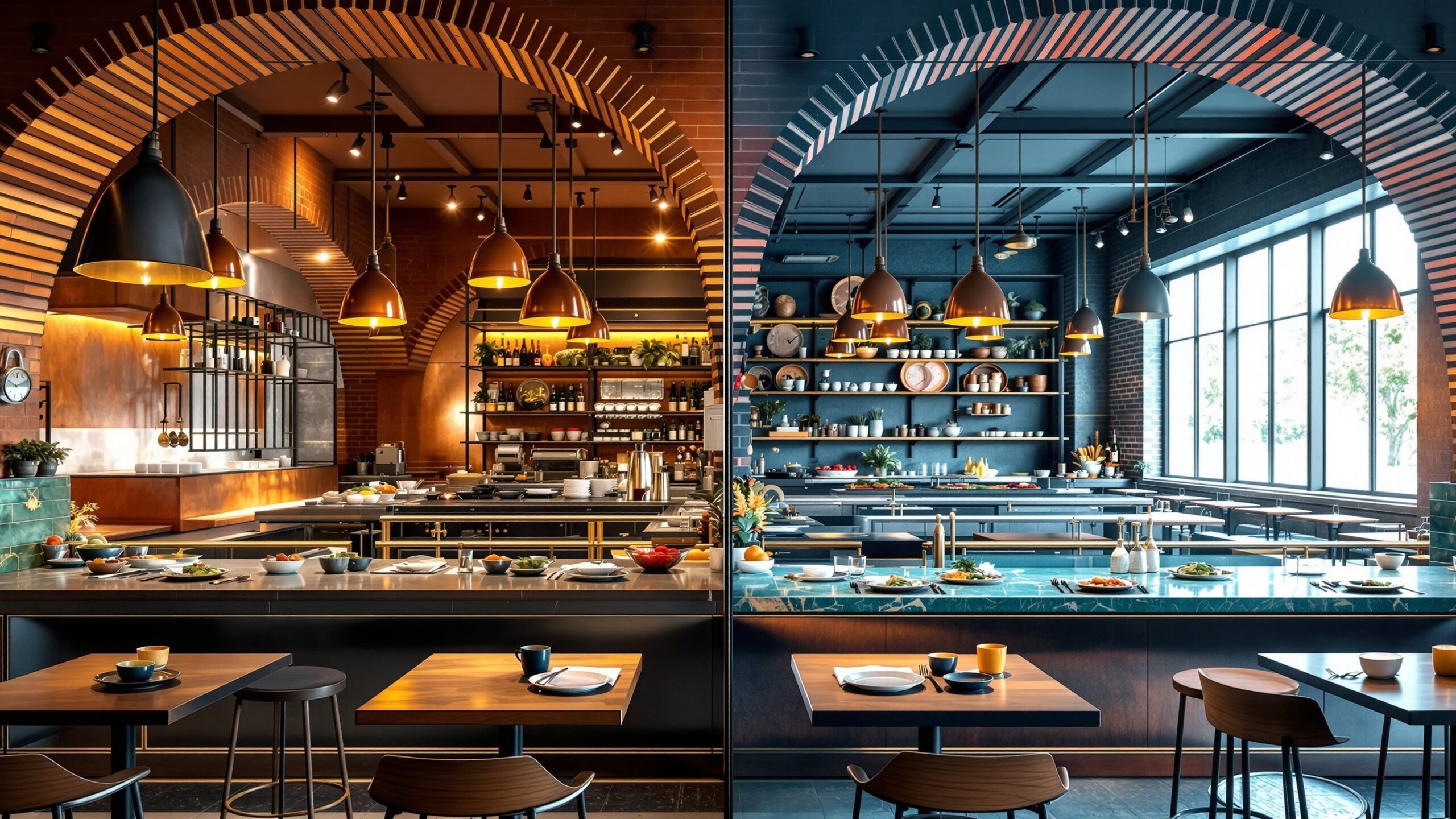
Blue: The Appetite Suppressor with Strategic Value
Blue is one of the least common colors in restaurant design, and that is not by accident. It is known to suppress appetite because it is rarely found in natural foods. From an evolutionary perspective, blue can signal spoilage or artificiality, which may subconsciously reduce hunger.
Despite this, blue has a place in certain dining concepts. It conveys calmness, trust, and sophistication, making it suitable for upscale environments, seafood restaurants, or health-focused establishments where restraint and mindfulness are part of the experience.
When paired with complementary colors or used in lighting rather than surfaces, blue can add elegance without negatively impacting appetite. The key is balance and context.
Green: Freshness, Health, and Balance
Green is strongly associated with nature, freshness, and well-being. It signals quality ingredients, sustainability, and health-conscious choices. In an era where diners are increasingly mindful of what they eat, green has become a powerful tool for communicating trust and transparency.
Restaurants that emphasize organic, plant-based, or farm-to-table concepts often incorporate green into their design. It creates a calming atmosphere while reinforcing the idea of freshness and authenticity.
Green also has a balancing effect when combined with warmer tones. It can soften the intensity of reds and oranges, creating a more harmonious environment that encourages guests to linger comfortably.
Black and Dark Tones: Sophistication and Premium Perception
Dark colors such as black, charcoal, and deep browns are often used in fine dining and upscale establishments. These tones convey elegance, exclusivity, and luxury. They create a sense of intimacy and focus, allowing the food and presentation to take center stage. In dimly lit environments, darker palettes can make a space feel more refined and private. This often leads to longer dining times and higher spending, as guests settle into the experience rather than rushing through it. However, dark colors require careful lighting design. Without proper illumination, they can feel heavy or uninviting. When executed well, they elevate the entire dining experience.
White and Neutral Palettes: Cleanliness and Minimalism
White and neutral tones are associated with cleanliness, simplicity, and modernity. They are often used in contemporary restaurants to create a sense of openness and clarity.
These colors allow food to stand out visually, which can enhance perceived quality and presentation. In minimalist settings, the absence of visual clutter can make the dining experience feel more intentional and curated.
Neutral palettes also provide flexibility. They can be easily adapted with seasonal décor, lighting changes, or accent colors, making them a practical choice for evolving concepts.
How Color Influences Appetite
Color affects appetite both directly and indirectly. Warm tones like red and orange stimulate hunger by increasing physiological arousal, while cooler tones like blue may reduce it. Beyond biology, color also influences perception. For example, a dish served on a white plate may appear more vibrant and appealing than the same dish on a darker surface. The contrast enhances visual appeal, which can make food seem fresher and more flavorful. Lighting color also plays a role. Warm lighting can make food look richer and more inviting, while cool lighting may emphasize cleanliness but reduce warmth. The interplay between color and lighting is essential in creating an appetizing environment.
How Color Shapes Mood and Experience
Mood is a critical factor in dining behavior. A relaxed and comfortable guest is more likely to stay longer, order additional items, and return in the future. Color sets the emotional tone of the space and influences how guests interact with it.
Warm colors create energy and excitement, making them ideal for high-traffic environments. Cool colors promote relaxation and focus, which is better suited for leisurely dining experiences. The combination of colors matters as much as the individual hues. A balanced palette can guide the emotional journey of the customer, from arrival to departure.
The Impact of Color on Spending Behavior
Color does more than influence mood—it directly affects spending. Restaurants that use warm, stimulating colors often see faster turnover and higher impulse purchases. Customers are more likely to order quickly and add items without overanalyzing.
In contrast, restaurants with calming, sophisticated palettes tend to encourage longer stays. This can lead to higher average checks, as guests are more inclined to order appetizers, desserts, and additional drinks.
Perceived value is also influenced by color. Dark, rich tones can make a space feel more premium, allowing for higher price points. Bright, playful colors may signal affordability, encouraging volume-based sales.
Color Zoning: Designing Different Experiences Within One Space
Modern restaurants often use color zoning to create distinct areas within the same space. For example, a quick-service counter might feature energetic colors, while a seating area uses more subdued tones to encourage relaxation.
This approach allows restaurants to cater to different customer needs simultaneously. It also creates visual interest and depth, making the space feel more dynamic and engaging.
Color zoning can be subtle, using variations in shade or lighting, or more pronounced with contrasting palettes. Either way, it adds a layer of intentionality to the design.
Cultural Considerations in Color Choices
Color meanings can vary across cultures, which is important for restaurants serving diverse audiences. While red may symbolize excitement and appetite in many Western contexts, it can also represent luck and prosperity in other cultures. Understanding these nuances ensures that color choices resonate positively with the target audience. It also prevents unintended associations that could affect perception. Global restaurant brands often adapt their color strategies to align with local preferences while maintaining brand identity.
The Role of Branding and Consistency
Color is a key component of brand identity. From logos to interior design, consistent use of color reinforces recognition and trust. When customers see familiar colors, they associate them with previous experiences and expectations.
Successful restaurants integrate their brand colors seamlessly into the physical space. This creates a cohesive experience that extends beyond the plate.
Consistency does not mean rigidity. Variations in tone, texture, and lighting can add depth while maintaining a unified visual language.
Lighting and Color: A Critical Partnership
Color does not exist in isolation—it is shaped by lighting. The same color can appear dramatically different under various lighting conditions. Warm lighting enhances reds and oranges, while cool lighting emphasizes blues and greens.
Restaurants must consider how lighting interacts with their color palette throughout the day. Daytime dining may require brighter, more neutral lighting, while evening service benefits from warmer, softer tones.
Dynamic lighting systems allow for adjustments that align with different moods and occasions, enhancing the overall experience.
Practical Tips for Choosing Restaurant Colors
Choosing the right color palette begins with understanding the restaurant’s concept and goals. Is the focus on speed or experience? Affordability or luxury? Social energy or quiet intimacy? From there, colors should be selected to support those objectives. Accent colors can add energy, while base tones provide stability. Materials and textures also influence how colors are perceived, adding another layer of complexity. Testing and iteration are essential. What works in theory may feel different in practice, so real-world evaluation is key.
The Future of Color in Restaurant Design
As technology and consumer preferences evolve, so does the role of color in restaurant design. Digital menus, LED lighting, and immersive environments are expanding the possibilities for dynamic color experiences.
Sustainability is also influencing color choices, with natural materials and earthy tones becoming more prominent. These trends reflect a growing desire for authenticity and connection.
In the future, color will continue to be a powerful tool for storytelling, shaping not just how restaurants look, but how they feel and function.
Designing with Intention
Color is more than decoration—it is a strategic element that shapes every aspect of the dining experience. From stimulating appetite to influencing spending behavior, its impact is both subtle and profound. Restaurants that understand and harness the power of color can create environments that not only look beautiful but also perform effectively. By aligning color choices with brand identity, customer expectations, and operational goals, they can craft experiences that resonate on every level. In a world where first impressions matter and competition is fierce, color becomes a silent but powerful partner in success.