
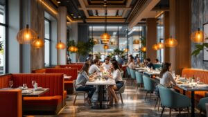
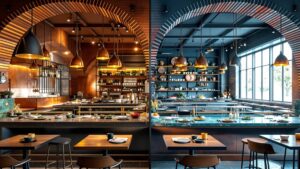
Color is more than decoration—it’s atmosphere, appetite, emotion, and memory served on a plate. The moment a guest steps into a dining room, their senses are already deciding how the experience will feel. A deep crimson wall whispers indulgence. Soft amber lighting invites comfort and lingering conversation. A splash of citrus yellow sparks energy, brightens plates, and makes laughter feel lighter. Color shapes the meal long before the first bite ever touches the tongue. In Color & Mood in Dining, we explore the subtle psychology behind palette and plate, the way a single hue can elevate a meal from pleasant to unforgettable. Here, you’ll find guides on pairing tones with cuisine, mood-mapping through lighting, and real-world examples of restaurants that use design like chefs use spices—boldly, thoughtfully, irresistibly. Whether you’re designing a serene brunch space, a luxurious dinner setting, or a playful bistro bursting with life, this hub is your culinary color wheel. Step in, scroll through, and discover how color doesn’t just fill a room—it flavors it.
A: Warm hues feel welcoming, cozy, and appetite-friendly, making guests more comfortable settling in for a full meal.
A: They don’t alter flavor chemically, but they shape expectations—our brains connect certain colors with richness, freshness, or sweetness.
A: Softer light flatters people, deepens colors, and creates a slower, more intimate pace that encourages longer stays.
A: The best color is the one that matches your concept—bold for energetic social spots, softer and muted for relaxed, lingering dinners.
A: Small seasonal shifts and accent changes can keep things fresh without constant full-scale remodels.
A: Bright, reflective surfaces and high-contrast schemes often amplify energy and volume, especially when paired with lively music.
A: Yes—brighter, high-energy colors suit quick-turn tables, while softer palettes support slower, multi-course experiences.
A: Phone cameras struggle with mixed light; restaurant lighting is designed for mood first, not for perfect, neutral photography.
A: Many don’t name it directly, but they feel it in their overall impression—“cozy,” “romantic,” “fun,” or “too bright.”
A: Start with accents—napkins, florals, wall art, or special-occasion menus—then expand if guests respond positively.
How Restaurant Colors Influence Appetite, Mood, and Spending
Color isn’t just décor-it’s a powerful tool that shapes how guests feel, eat, and spend. From appetite-boosting reds to calming neutrals, discover how smart color choices transform restaurant experiences and drive real results.
The Psychology of Color in Restaurant Design: What Really Works?
Color isn’t just decoration—it’s a powerful force that shapes how diners feel, order, and spend. Explore the psychology behind restaurant design and discover which color strategies truly work to create unforgettable dining experiences that keep guests coming back.