Color is one of the most powerful yet often underestimated tools in restaurant design. Long before a guest tastes the first bite, the visual environment begins shaping expectations, emotions, and even purchasing behavior. From the warmth of deep reds to the calming influence of soft greens, color subtly communicates a restaurant’s identity while influencing how long people stay, how much they spend, and how they feel during their visit. Understanding the psychology of color in restaurant design is not simply about aesthetics—it’s about strategy. The most successful restaurants don’t choose colors randomly; they use them deliberately to guide mood, appetite, and customer flow. When executed thoughtfully, color becomes a silent partner in the dining experience, enhancing everything from brand perception to revenue.
A: Warm tones like red, orange, and yellow are commonly linked with energy, warmth, and appetite stimulation.
A: Blue can feel clean and stylish, but it is generally less associated with hunger and warmth than food-friendly warm tones.
A: No. Red can be powerful, but it works best when it fits the brand, cuisine, pace, and lighting strategy.
A: Deep neutrals, jewel tones, warm woods, and low-saturation palettes often support a more intimate and upscale atmosphere.
A: Greens, soft neutrals, and natural earth tones often communicate freshness, wellness, and ingredient-driven dining.
A: Yes. Overuse of bright colors can feel chaotic, visually tiring, and less comfortable for guests who want to relax.
A: They can. Brighter energetic palettes may encourage quicker turnover, while softer darker tones can support longer stays.
A: Not exactly. The interior should support the brand identity without making the room feel overly literal or repetitive.
A: Absolutely. Color and lighting are inseparable, and the wrong light temperature can completely alter a palette.
A: A balanced palette that fits the food, target audience, service style, and mood of the space usually performs best.
Why Color Matters More Than You Think
The human brain processes color in milliseconds, triggering emotional and physiological responses almost instantly. In a restaurant setting, this means guests are already forming impressions before they read a menu or interact with staff. Color can signal comfort, luxury, speed, freshness, or indulgence, depending on how it is used.
Warm tones like red, orange, and yellow are known to stimulate appetite and create a sense of urgency. This is one reason many fast-casual and quick-service restaurants lean heavily on these hues. In contrast, cooler tones such as blue and green tend to slow people down, encouraging relaxation and longer dining experiences.
The key is alignment. A mismatch between color and concept can create subtle discomfort. A fine dining restaurant filled with bright neon colors may feel chaotic rather than refined, while a quick-service burger spot painted in muted pastels may lack energy and turnover efficiency.
The Appetite Connection: Colors That Influence Hunger
Certain colors have a direct psychological link to appetite. Red is often considered the most powerful in this category. It raises heart rate, stimulates excitement, and encourages quick decision-making, which can translate into faster ordering and higher table turnover.
Orange carries similar energy but with a more playful and approachable tone. It feels friendly and inviting, making it a strong choice for casual dining environments where comfort and sociability are priorities. Yellow, often associated with happiness and warmth, can enhance mood and create a welcoming first impression, though it must be used carefully to avoid overstimulation.
Interestingly, blue is one of the least appetite-stimulating colors. Because it rarely appears naturally in food, it can subconsciously suppress hunger. This doesn’t mean blue should be avoided entirely, but it is typically used as an accent or in seafood restaurants where it reinforces a thematic connection rather than serving as the dominant color.
Green, on the other hand, has become increasingly popular as diners gravitate toward health-conscious and sustainable dining. It communicates freshness, balance, and natural ingredients, making it especially effective in farm-to-table concepts, juice bars, and plant-forward menus.
Setting the Mood: Creating Emotional Atmospheres
Color doesn’t just influence what people eat—it shapes how they feel while eating. The emotional tone of a restaurant can be carefully calibrated through color choices, creating environments that range from high-energy and social to calm and intimate.
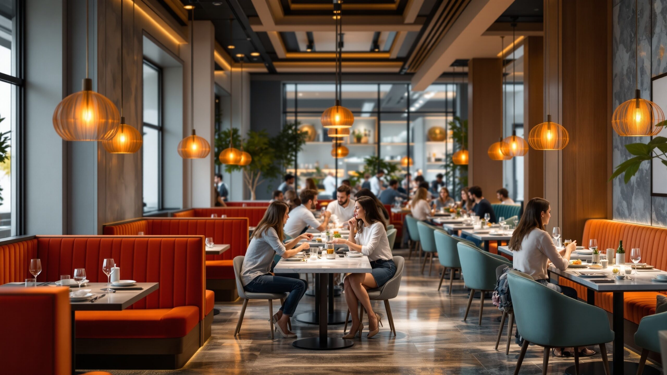
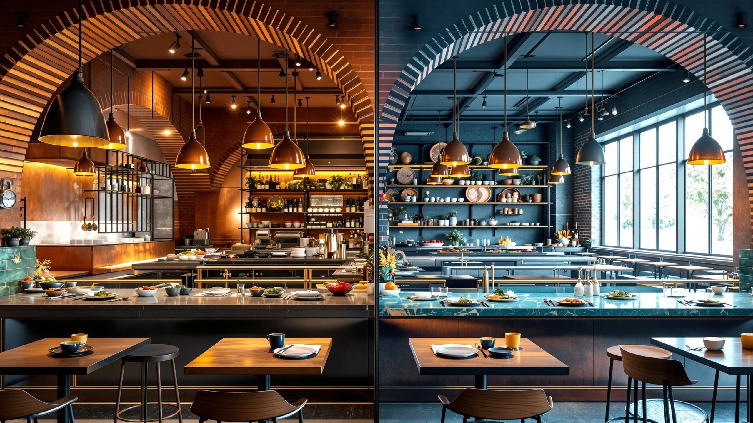
Deep, rich tones like burgundy, forest green, and charcoal create a sense of sophistication and intimacy. These colors absorb light, making spaces feel more enclosed and private, which is ideal for upscale dining experiences where guests are encouraged to linger.
Lighter tones such as soft beige, cream, and pastel shades create openness and airiness. These palettes are often used in cafés and brunch spots where natural light plays a central role and the atmosphere is relaxed yet vibrant.
High-contrast color schemes can add visual excitement but must be handled with care. Too much contrast can create visual fatigue, while too little can make a space feel flat and uninspired. The balance between stimulation and comfort is where effective design lives.
Color and Customer Behavior: Driving Decisions and Spending
Beyond mood and appetite, color plays a subtle but measurable role in purchasing behavior. Strategic use of color can influence how quickly customers make decisions, how they perceive value, and even how much they are willing to spend.
For example, warm colors tend to encourage quicker decision-making, which is beneficial in high-traffic environments. This can lead to faster table turnover and increased revenue during peak hours. In contrast, cooler tones can slow down the pace, encouraging guests to order additional drinks, desserts, or courses.
Color also affects perceived pricing. Darker, richer palettes are often associated with luxury and exclusivity, allowing restaurants to position themselves at a higher price point. Lighter, brighter palettes tend to feel more casual and accessible, aligning with more affordable offerings.
Menu design also plays a critical role. Highlighting certain dishes with color accents can draw attention and subtly guide ordering choices. Even small details, such as the color of a plate or the background of a menu section, can influence what customers choose.
Branding Through Color: Building Recognition and Identity
Color is a cornerstone of brand identity in the restaurant industry. Think about how quickly certain color combinations evoke specific brands or dining experiences. This recognition is not accidental; it is the result of consistent and intentional design choices.
A strong color palette reinforces a restaurant’s concept and helps it stand out in a crowded market. Whether it’s the bold reds of a fast-food chain or the earthy tones of a sustainable café, color becomes part of the story a restaurant tells. Consistency is key. The colors used in the interior design should align with the logo, website, packaging, and marketing materials. This creates a cohesive experience that builds trust and familiarity over time.
At the same time, differentiation matters. While it’s important to understand industry trends, blindly following them can lead to a lack of originality. The most memorable restaurants find ways to use color in unique and unexpected ways while still aligning with their brand values.
Cultural Influences and Color Perception
Color meanings are not universal; they are shaped by cultural context. What feels warm and inviting in one culture may carry a completely different connotation in another. For restaurants that serve diverse audiences or operate in multicultural environments, understanding these nuances is essential.
Red, for example, is associated with luck and prosperity in many Asian cultures, making it a popular choice in restaurants that want to convey celebration and abundance. In Western contexts, it is often linked to passion and energy.
White can symbolize cleanliness and simplicity in some cultures, while in others it may be associated with mourning. Green may represent freshness and nature in one region and carry religious or symbolic meanings in another. Designing with cultural awareness ensures that color choices resonate positively with the target audience rather than creating unintended discomfort or confusion.
Lighting and Color: The Hidden Partnership
Color does not exist in isolation; it is deeply influenced by lighting. The same paint color can look dramatically different under warm, cool, or natural light. This makes lighting design an essential component of color strategy.
Warm lighting enhances reds, oranges, and yellows, creating a cozy and inviting atmosphere. It can make food appear richer and more appealing, which is why it is commonly used in dining areas. Cooler lighting, on the other hand, can make spaces feel cleaner and more modern but may reduce the visual warmth of food.
Natural light introduces another layer of complexity. It changes throughout the day, altering how colors are perceived. Restaurants that rely heavily on daylight must consider how their color palette will evolve from morning to evening. Balancing artificial and natural lighting ensures that the intended mood and aesthetic remain consistent regardless of the time of day.
Trends in Restaurant Color Design
While timeless principles guide color psychology, trends continue to evolve. In recent years, there has been a shift toward more natural and organic palettes. Earth tones, muted greens, and warm neutrals reflect a broader cultural emphasis on sustainability and wellness.
At the same time, bold accent colors are being used more strategically to create focal points. A single vibrant wall, a striking piece of furniture, or a colorful bar area can add personality without overwhelming the space.
Monochromatic schemes are also gaining popularity, offering a clean and cohesive look that feels modern and sophisticated. These designs rely on subtle variations in tone and texture rather than dramatic color contrasts.
Technology is influencing color choices as well. With the rise of social media, restaurants are increasingly designing spaces that photograph well. Colors that pop on camera and create visually appealing backdrops can drive organic marketing through customer-generated content.
Common Mistakes in Restaurant Color Design
Despite its importance, color is often mishandled in restaurant design. One of the most common mistakes is overuse. Too many bold colors competing for attention can create visual chaos and detract from the dining experience. Another frequent issue is ignoring context. A color that works beautifully in one type of restaurant may feel completely out of place in another. Design decisions must always be rooted in the concept, target audience, and desired experience.
Poor lighting can also undermine even the best color choices. Without proper illumination, colors may appear dull, distorted, or inconsistent. This can negatively impact both the ambiance and the presentation of food. Finally, neglecting the emotional impact of color can lead to missed opportunities. Every color choice should serve a purpose, whether it’s enhancing appetite, encouraging relaxation, or reinforcing brand identity.
What Really Works: A Strategic Approach to Color
Successful restaurant color design is not about following rigid rules; it’s about understanding principles and applying them thoughtfully. The most effective spaces are those where color, lighting, and branding work together seamlessly.
Start by defining the desired experience. Is the goal to create a lively, fast-paced environment or a calm, luxurious retreat? Once the emotional tone is clear, color choices can be aligned accordingly.
Next, consider the target audience. Different demographics may respond differently to color, and preferences can vary based on age, culture, and lifestyle. Designing with the audience in mind ensures relevance and appeal.
Testing is also essential. Colors should be evaluated in the actual space under real lighting conditions. What looks perfect on a sample card may not translate the same way on a full wall.
Finally, balance is everything. Combining dominant colors with complementary accents creates depth and interest without overwhelming the senses. The goal is to create an environment that feels intentional, cohesive, and inviting.
The Future of Color in Restaurant Design
As dining experiences continue to evolve, so too will the role of color. Technology, sustainability, and changing consumer preferences will shape how restaurants approach design in the years ahead. Adaptive lighting systems that change color throughout the day may become more common, allowing restaurants to shift mood seamlessly from breakfast to dinner service. Sustainable materials and natural pigments may influence color palettes, aligning design with environmental values.
Personalization could also play a role, with spaces designed to appeal to specific customer segments or even adapt to individual preferences. As the line between physical and digital experiences continues to blur, color will remain a powerful tool for creating memorable and meaningful dining environments.
Final Thoughts
The psychology of color in restaurant design is both an art and a science. It requires an understanding of human behavior, cultural context, and design principles, combined with a creative vision that brings a concept to life. When used effectively, color does more than decorate a space—it shapes the entire dining experience. It influences how guests feel, how they interact, and ultimately, how they remember a restaurant long after the meal is over.
In a competitive industry where every detail matters, mastering the use of color can be a defining factor in success. The restaurants that truly stand out are those that recognize color not as an afterthought, but as a fundamental element of design strategy—one that has the power to transform spaces, elevate brands, and create unforgettable experiences.